
Product design case study
Introduction
Understanding problems
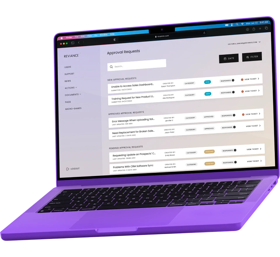
Design and develop a flexible, user intuitive, web application that facilitates certain procedural and communicative tasks around compliance for both managers and a wider, distributed team of sales representatives. This tool aims to replace several other SaaS tools, forming a centralised hub.
Problems
Several tools, across different platforms, required to support required needs
Complex and decentralised communication channels cause inefficiencies
Distributed sales team across the United States. Mobile first users, potential inconsistent connections
Challenging to organise and track compliance user progress
Objectives
Reduce complexity
Improve communication
Drive engagement
Centralise the experience
Reinforce compliance learning
Mobile-first experience for sales users
One of the core objectives is to increase communication and remove the current friction, through this there was an overarching need to drive engagement that was particularly low through their current tool process. The proposal was to track user engagement in the platform over time against their previous toolset to see if we’d met our objectives and to outline further improvements or additions to the platform.
Finally, the platform had to be modular and allow for future iteration with a potential to full replace the whole companies string of compliance SaaS products into a single bespoke platform.
Attribution
Project partners
Working with Midnight Studio, my role in the project was to work with stakeholders from kick-off, planning, and managing workshops through the discovery phase to best understand the problems, define goals, plan research, and translate our findings into architecture and wireframes.
Product Designer
Richard Nash
www.mrbiscuit.com
Research
User Experience
Information Architecture
Wireframes
User Interface
Agency
Midnight Studio
Project Owner
Front-end
Back-end
Project Management
Quality Assurance
Interface Designer
Cameron Scott
Interface Design
Digital Brand
Design Process
Design thinking
By combining design thinking and agile methodologies, I empathise with users, define problems, ideate creative solutions, prototype, validate, and implement the best ideas. This iterative process ensures a deep understanding of user needs and efficient project execution, fostering collaboration and delivering exceptional user experiences.
One
Empathise
Gain a profound understanding of users' perspectives, needs, and challenges through research and observation, fostering empathy and generating valuable insights to inform the design process.
Two
Define
Clearly articulate the problem or opportunity based on insights and analysis, synthesising the information to form a focused and actionable problem statement that guides the design process.
Three
Ideate
Generate diverse ideas and concepts through brainstorming and creative thinking. Explore innovative solutions to address the problem or opportunity identified during the design thinking process.
Four
Prototype
Transform ideas into tangible representations, using various tools and techniques, such as wire-framing and prototyping, to validate and iterate on design solutions through user testing.
Five
Validate
Test and gather feedback on the prototypes to evaluate their effectiveness and alignment with user needs. Iterate based on insights gained to refine and improve the design solution.
Six
Implement
Translate the refined design solution into a functional product or service, utilising the necessary tools, technologies, and resources. Ensure seamless integration and bring the design vision to life.

1
Empathise
2
Define
3
Ideate
4
Prototype
5
Validate
6
Implement
Tool stack
Using key tools like Figma, Miro, and Framer, I streamline workflows, enhance ideation, and create intuitive prototypes. Coupled with Typeform and ChatGPT for insightful user research, I deliver top-tier, user-aligned digital solutions, fostering innovation and impactful experiences.
Understanding Phase
Empathise with users and define the problems
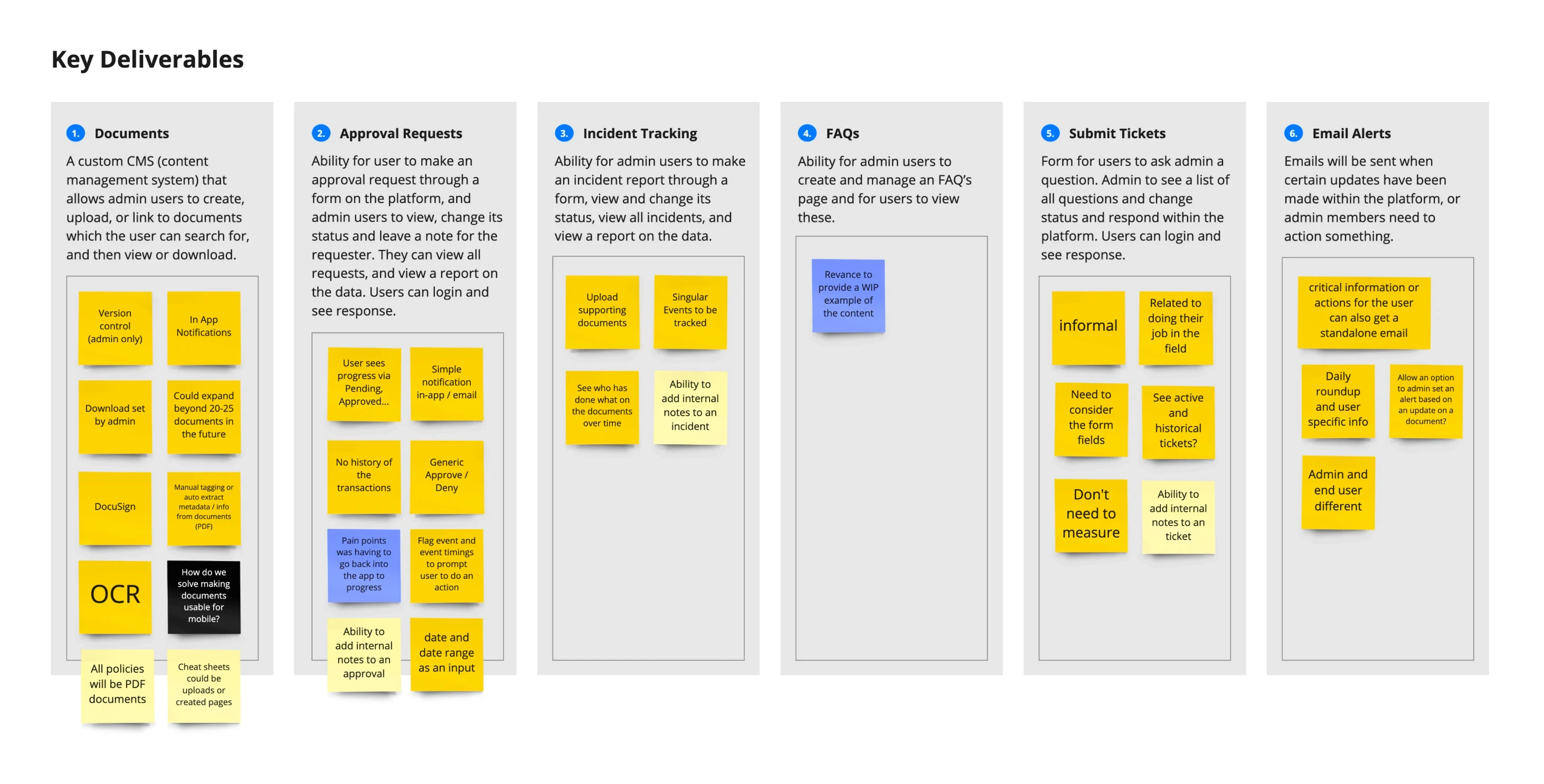
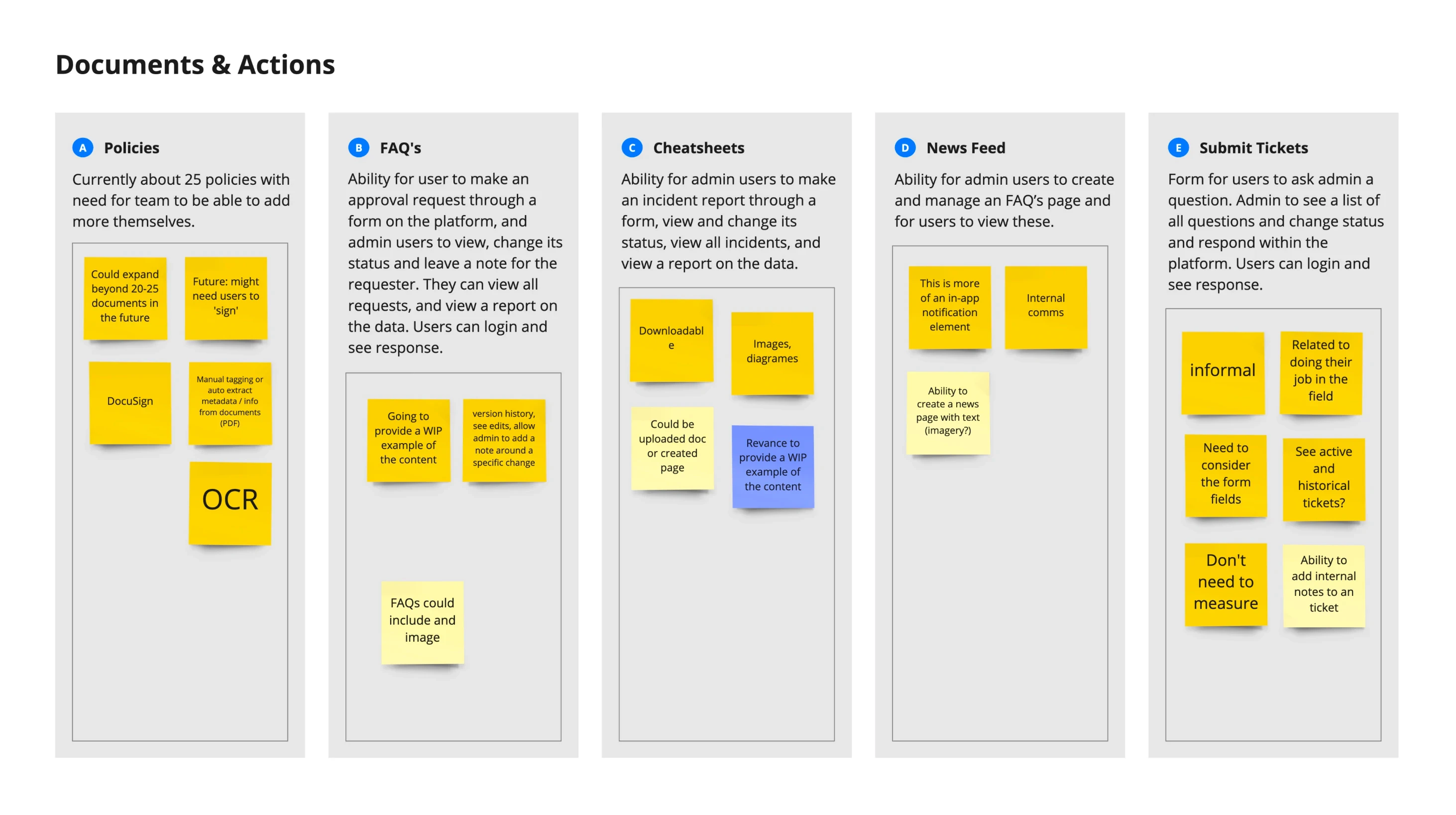
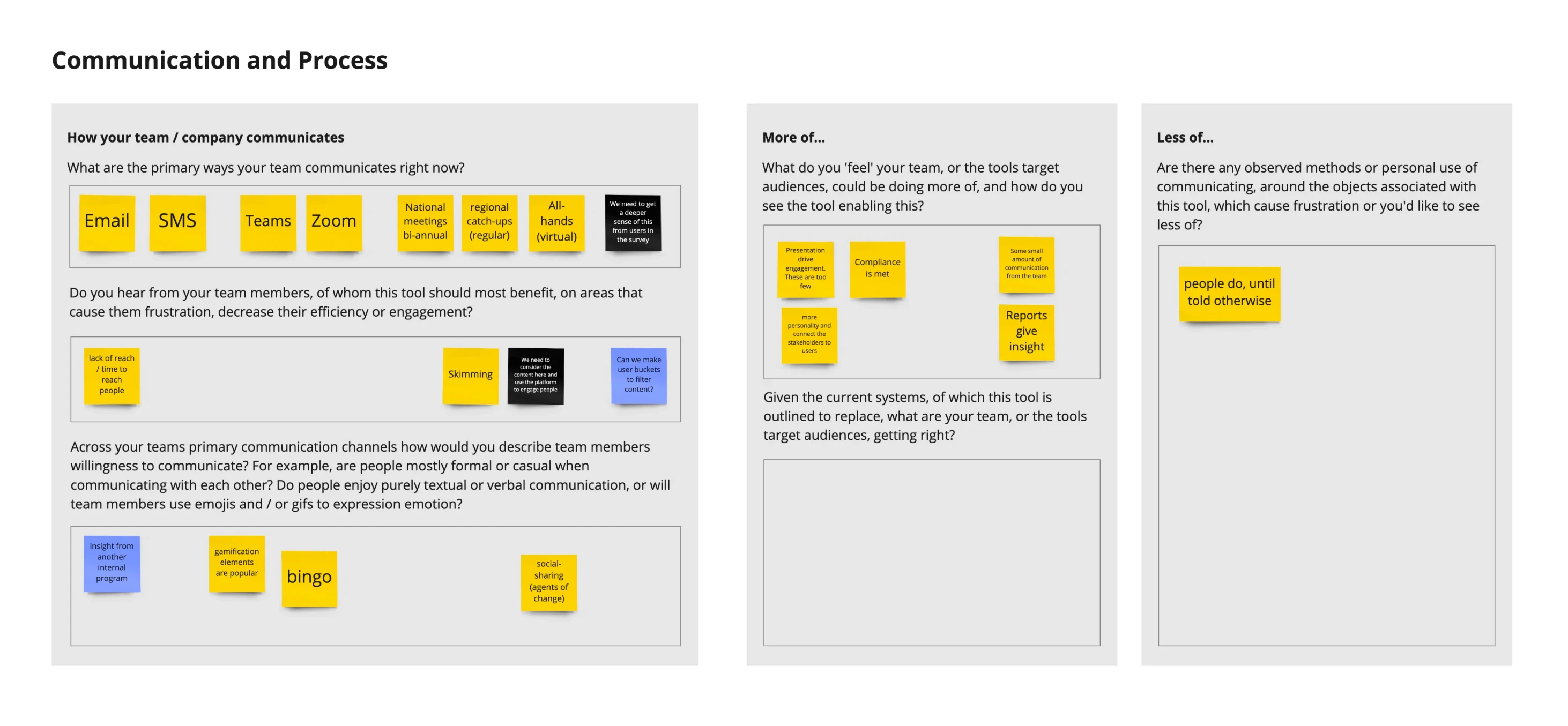
Working with stakeholders, we conducted several workshops to better understand the problems that led to the team at Revance seeking a bespoke solution to their challenge. After kick-off, a simple question deck was produced inside Miro for stakeholders to conduct in their own time. We used this first set of question tasks to help refine what had been discussed in our kick-off meeting and from materials we’d collected from the proposal stage. Essentially, we wanted to scrutinise the critical problems as early as possible. All this early information and questioning then fed into the facilitated workshops.
We also wanted to outline and probe with stakeholders their accessibility requirements, alongside users social needs, learning difficulties, technology access and location as factors to consider as part of our design process to make sure the product was as accessible to users as possible beyond pure WCAQ requirements. During interviews we also sought corroboration from users directly on their needs to form our conclusions.
Research
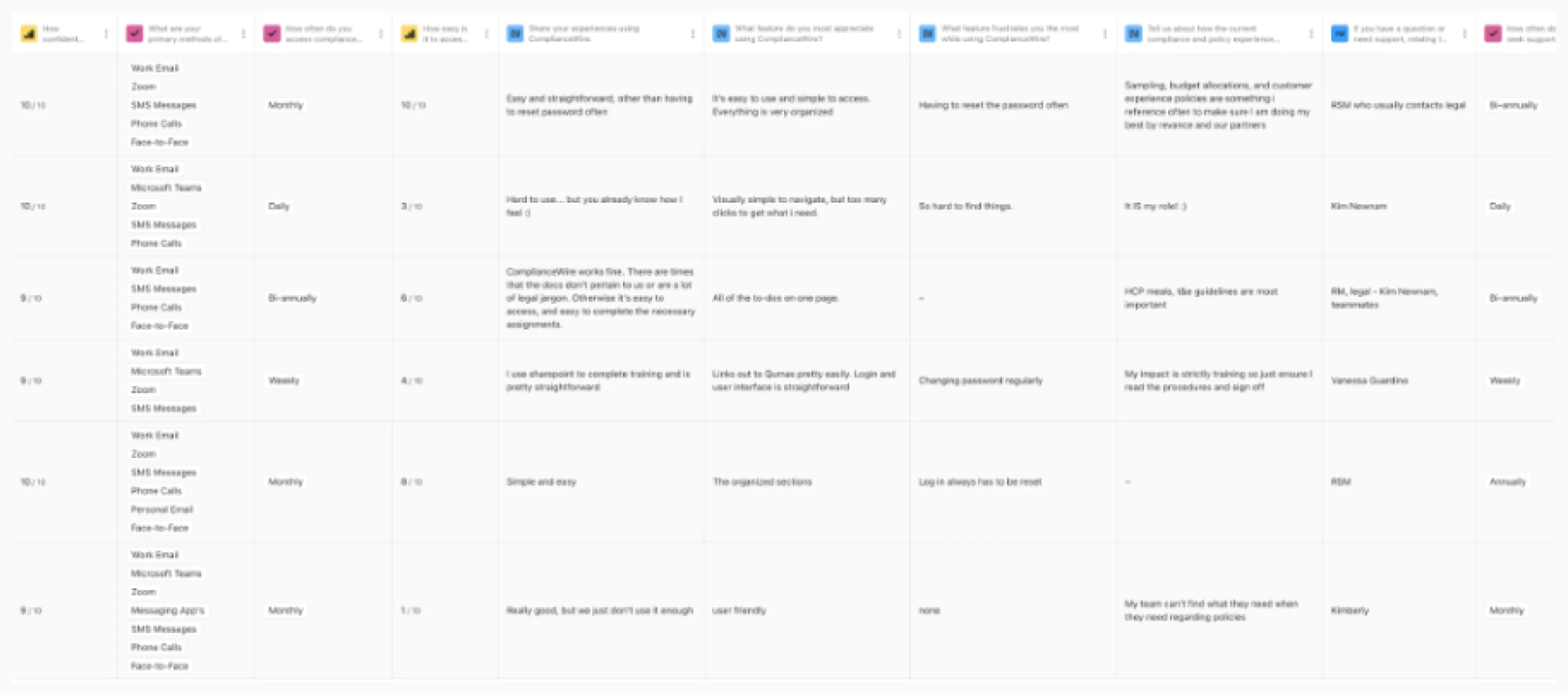
An expansive component of the workshops, and the discovery phase in general, was to build empathetic insight with users. Clearly engagement was an issue from our discussions, about current processes and use cases. Honestly having worked in compliance and digital learning previously this was hardly a surprise, however it was very insightful to see the challenges of using such a wide range of SaaS tools and different communication methods which didn’t support a consistent thread around critical. The ‘anchor’ tool which was used to complete compliance within this specific team was Compliance Wire, which we also wanted to probe with users around key frustrations and pain points.
User Insights
Initially we talked about the team needs and the cross section of users seeking to gain qualitative stakeholder insight around users. The stakeholders for the project, in this case, are the platforms direct administrators, alongside being the project owners. This presented an interesting opportunity to get perspectives from both sides of the user journey fence to compare. Following the workshops I worked to build a serious of interview questions for users that would seek to obtain insight and cross check against personal insight from the stakeholder workshops.
All insights from workshops, interviews / surveys where used to understand users environmental context and emotional connections. As the admin user based was very small they where combined into a single persona.
Flows and Architecture
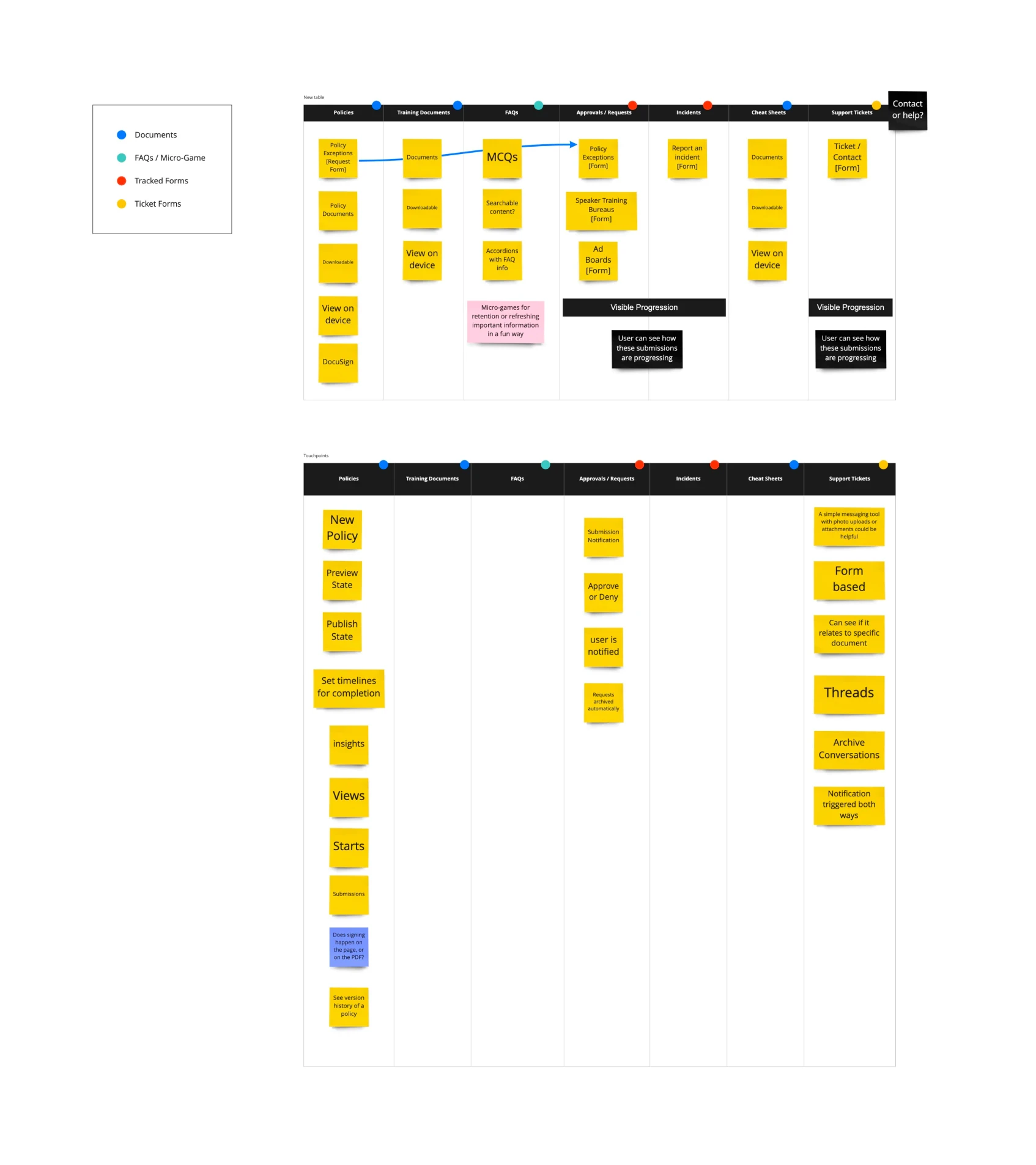
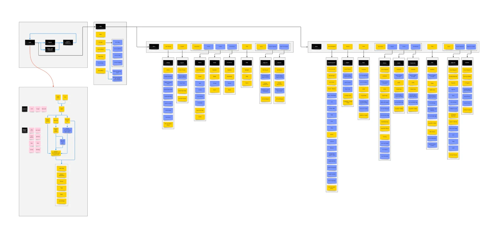
Using insight gathered we worked to understand different ways user and admin users would flow through all of the outlined materials. What steps would be different, if at all, between the two different views and how would these flows be impacted by mobile first vs desktop firsts views that where to align around the different user groups. Simple task flows where followed by more detail and allowed us to understand the user flow through all materials, how our research could be applied.
Explore
Ideate solutions and prototype
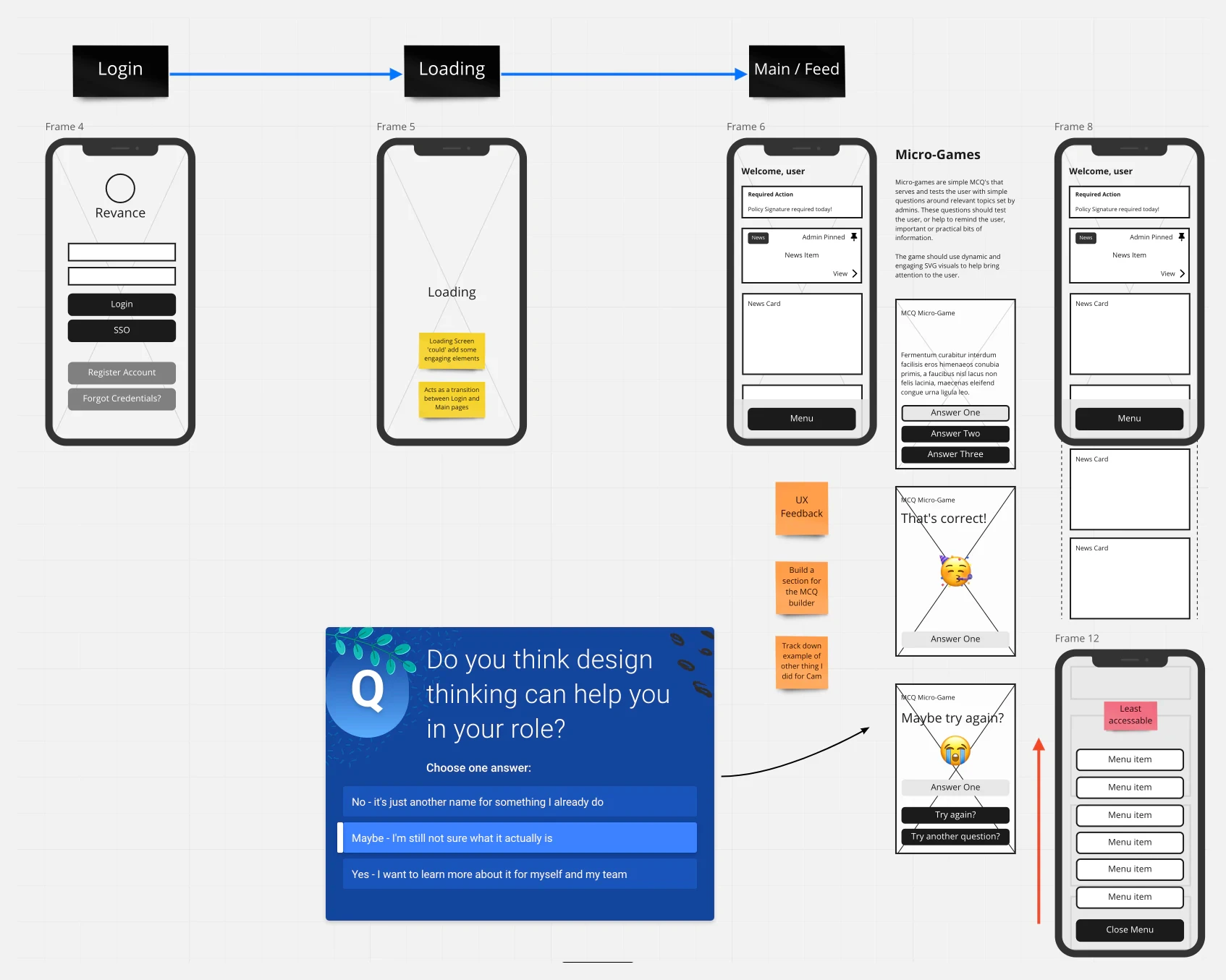
As we moved into the primary ideation state a key talking point had been around how to reinforce mandatory compliance. This is always a challenge within the learning experience sphere. We explored using a 'gamified' mcq micro-interaction that was visually engaging to make it feel more alluring to the user to interact. These would challenge the user a series of questions from compliance which they had completed. The idea was to help reinforce the core elements of the compliance in a noninvasive fashion, on the users feed.
Making Compliance Training Engaging
Compliance training is paramount in many businesses. However, research consistently shows that employees often view this training as just another box to tick, pushing its significance to the background even when legally required [1][2]. What's more concerning is that, after such training, the retention of critical information remains worryingly low.
One of the main obstacles with compliance training is the perceived disruption it brings to an employee's daily tasks. It's often seen as an interruption rather than an enhancement to their primary roles. Addressing this, our approach focused on reducing this perceived friction. By enhancing communication and offering tailored support, we aimed to alleviate the common feelings of unease and apprehension surrounding these obligatory sessions.
Yet, making the process smoother was only part of our objective. Merely completing training wasn't the benchmark for success; truly understanding and retaining the content was. Here, Behavioural Design came into the fold. This strategy, grounded in understanding employee behaviours and motivations, aimed to elevate compliance training from a mundane task to an enriching experience. Sitzmann and Weinhardt's (2018) findings highlight the general challenges in training engagement [1]. Aguinis and Kraiger (2009) stress the significant advantages of impactful training [2]—advantages that are tangible only when the training truly resonates.
To address the issues highlighted by research on training engagement and retention [1][2], we introduced a forward-thinking solution: a dynamic assessment system. Traditional compliance training often misses the mark in engagement and retention, a gap we sought to bridge with our innovative approach. This system empowered administrators to craft assessments specifically designed to gauge knowledge retention after training. But the real game-changer was the incorporation of gamified micro-interactions. Instead of relying on the conventional, often tedious, multiple-choice questions, we leveraged behavioural design principles to make the assessment process not just informative, but also intriguing. The use of game elements tapped into the inherent human desire for achievement and competition. This real-time, engaging feedback mechanism made comprehension gaps immediately apparent. And the benefits didn't stop at identification; it facilitated swift, targeted interventions, marking a departure from broad-brush training approaches to a nuanced, data-driven strategy. In essence, our solution was not merely about testing knowledge but about reinforcing learning in a manner that resonates.
In summary, this innovative approach not only changed the mechanics of compliance training but its entire perception. By interweaving active engagement with genuine understanding, we not only met the legal prerequisites but also cultivated an environment conducive to authentic learning and collaboration.
References:
1
Sitzmann, T., & Weinhardt, J. M. (2018). Training engagement theory: A multilevel perspective on the effectiveness of work-related training. Journal of Applied Psychology, 103(1), 14-34.
2
Aguinis, H., & Kraiger, K. (2009). Benefits of training and development for individuals and teams, organizations, and society. Annual Review of Psychology, 60, 451-474.
Exploring Different Needs
Two different users flows where created to service user needs based on insight, and requirements. Sales users are identified to be mostly on the road, moving between locations. The goal was to give a simple and intuitive mobile first experience that quickly showed them anything of priority but allow them to also complete all the required compliance stated in our objectives. Single handed use was also consider given how sales users where interacting between the tool and their work, putting key navigational and interactive elements into thumb reach.
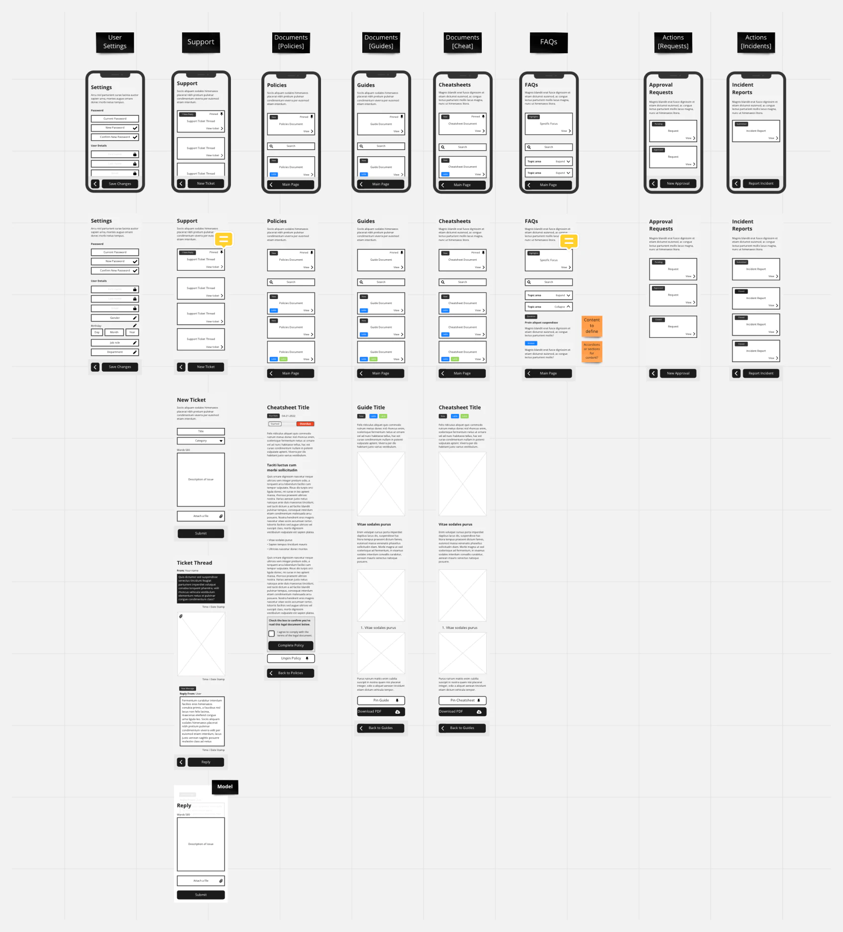
Admin users make up a much smaller team, not only are admin users responsible for administration but in fact are predominantly focused on delivering the services. Core subject knowledge is very high, and admin users are fully focused on content and supporting sales users. Unlike sales users, admins are desktop bound and co-located at the company offices.
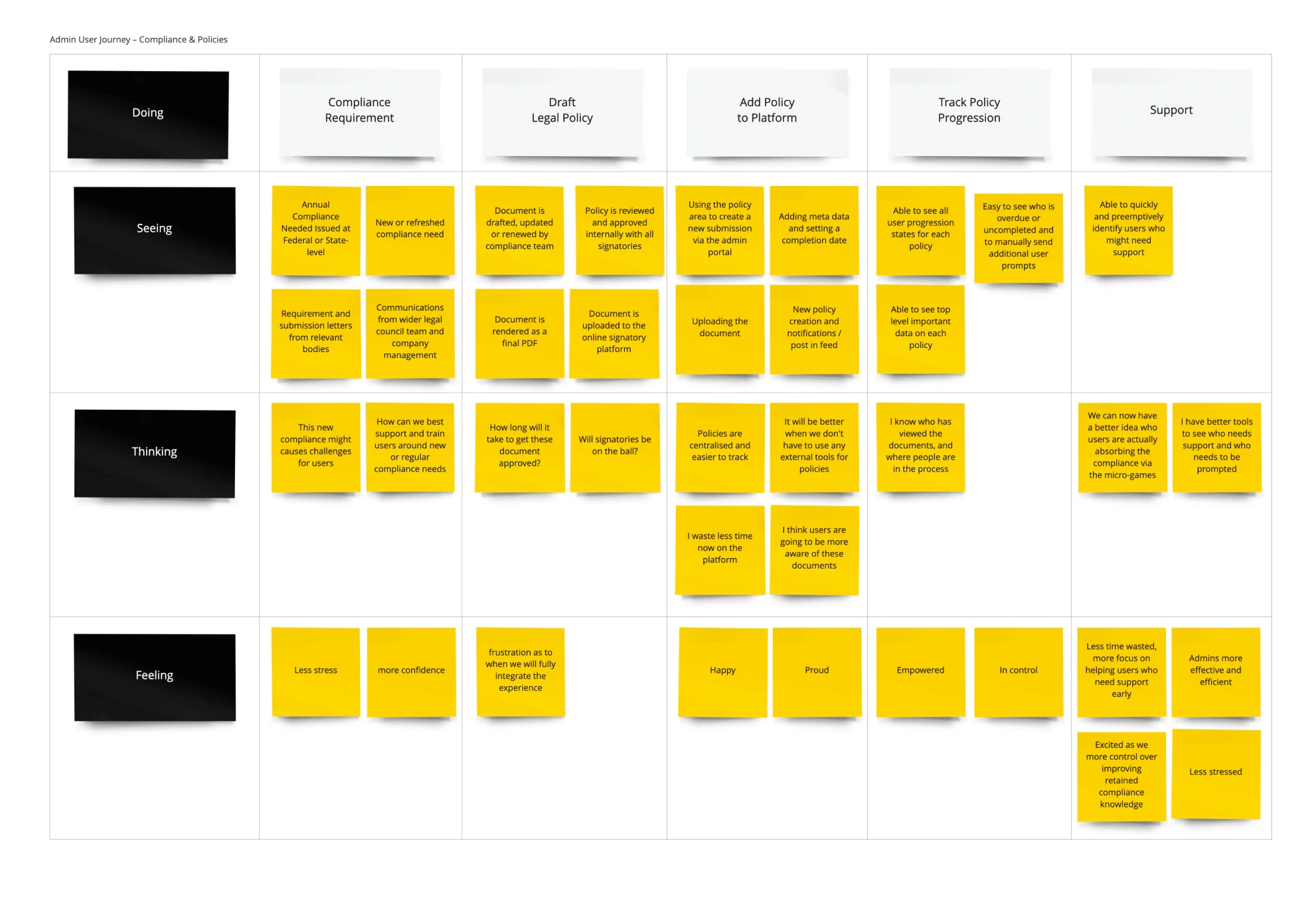
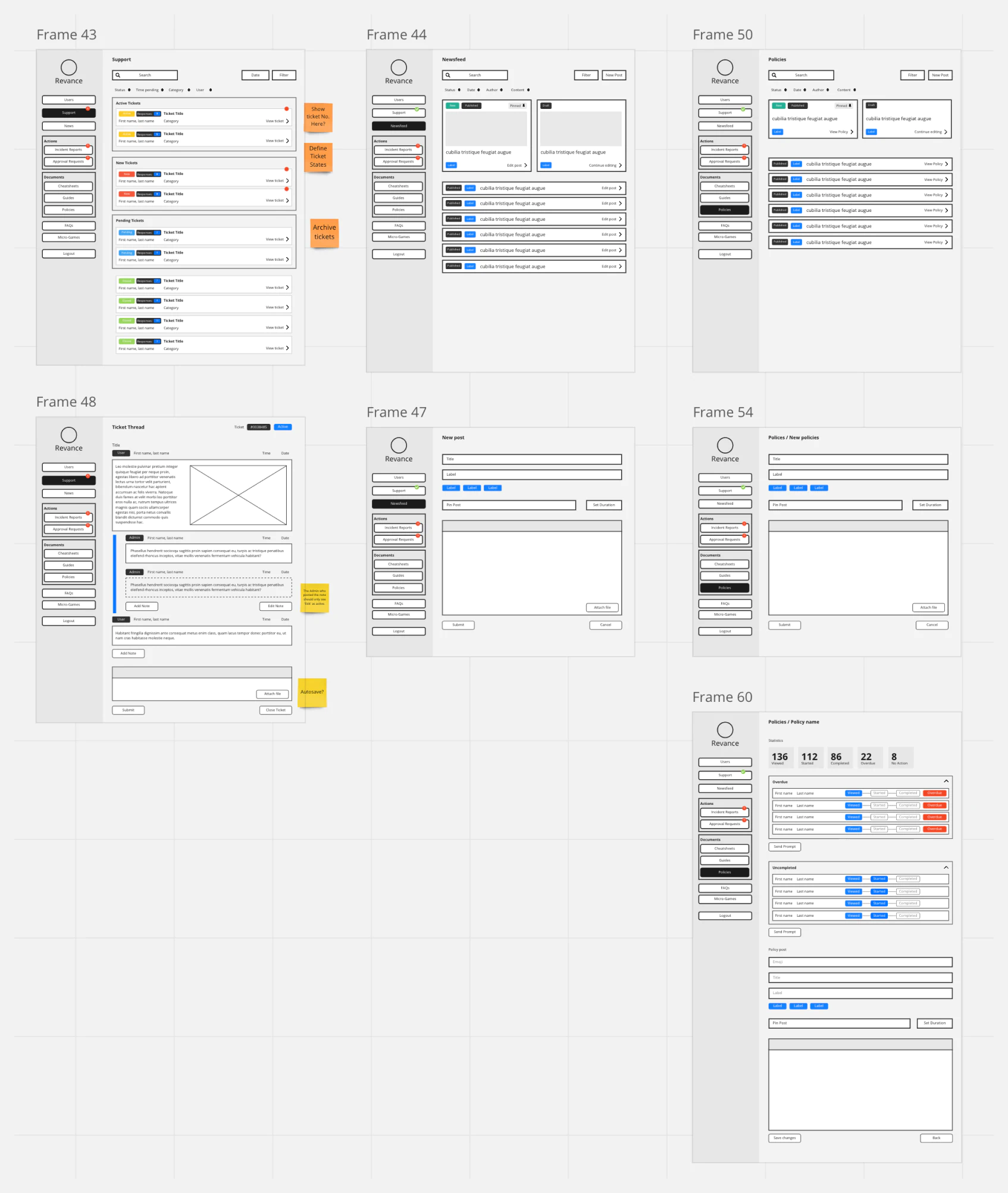
We wanted to make sure that key elements where always highlighted to the admin users, helping the admin users priorities their time on the most impactful or import task first. The platform essentially helping pre-filter and organise communications and tasks neatly into focus.
Compliance is a key component of the platform and there was an opportunity to improve the experience for both types of users around their annual and bi-annual compliance requirements. Firstly compliance templates would allow admin users start to transition towards a fully internal system over the longer term. Where signatures and paper handling can be done all inside the platform. We also where able to sign-post and track user engagement with the compliance documents to help admins track when and what a user had done on the road to completing their compliance before or to a deadline. This also translated to improving notifications and reminders for users, making sure it was a top-priority for them within their task load.
Materialise
Validate and implement
Wireframes and journeys where reviewed and refined working with all stakeholders, external and internal, in a cross-functional fashion. The agency utilised an external interface designer to implement the wireframes and experience findings into the interface production. Reasoning and findings where presented, alongside wireframes, when onboarding the interface designer into the project.
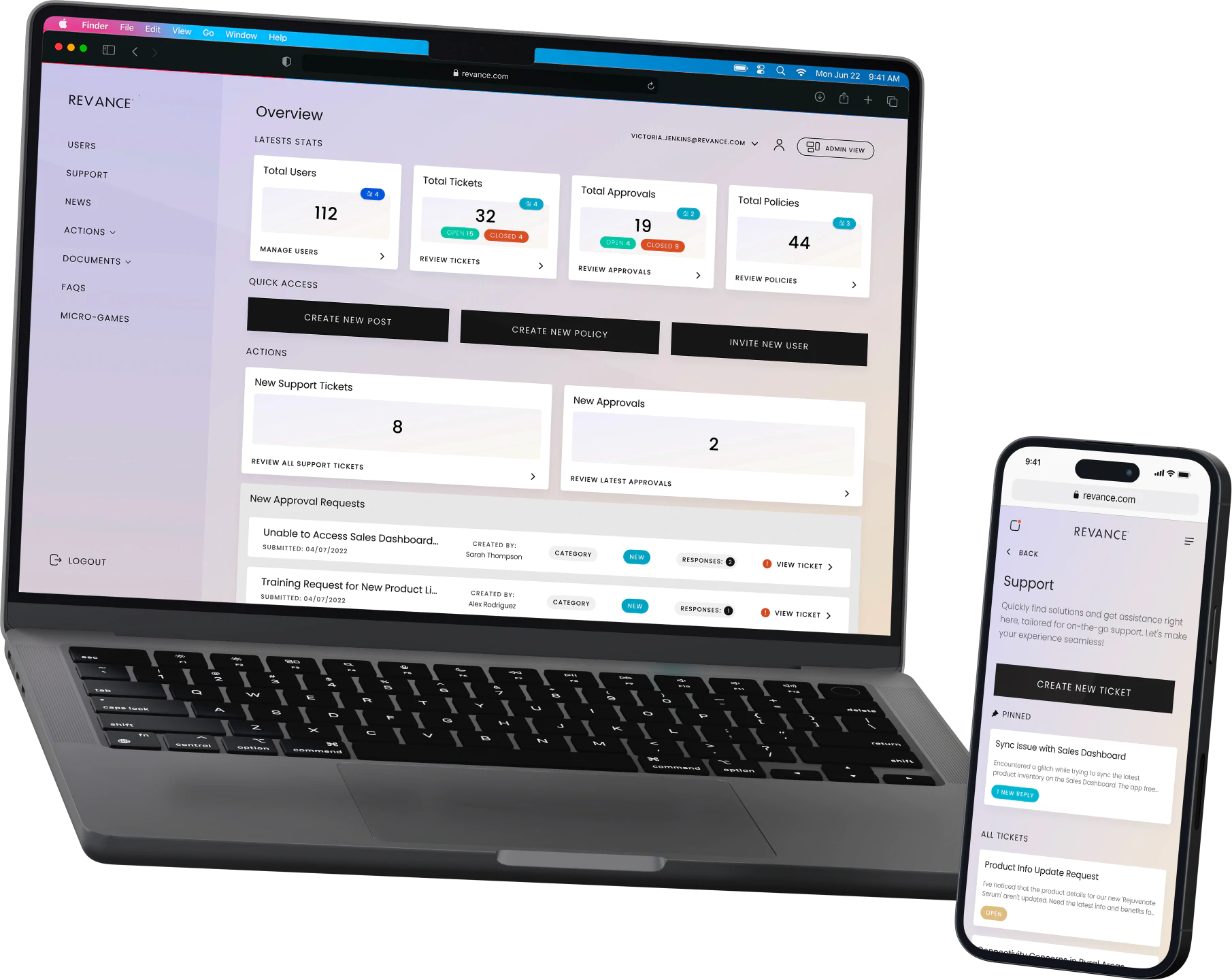
Specifically during the second round of reviews and feedback we identified that improving the admin landing page would add value. Previously this was very much like the feed for sales users, with top level card areas that highlights important tasks and a notification area. This was redesigned to improve the overall view for admins, giving them more key information and statistics with a quick actions area for tasks that admins feedback would be most used and useful.
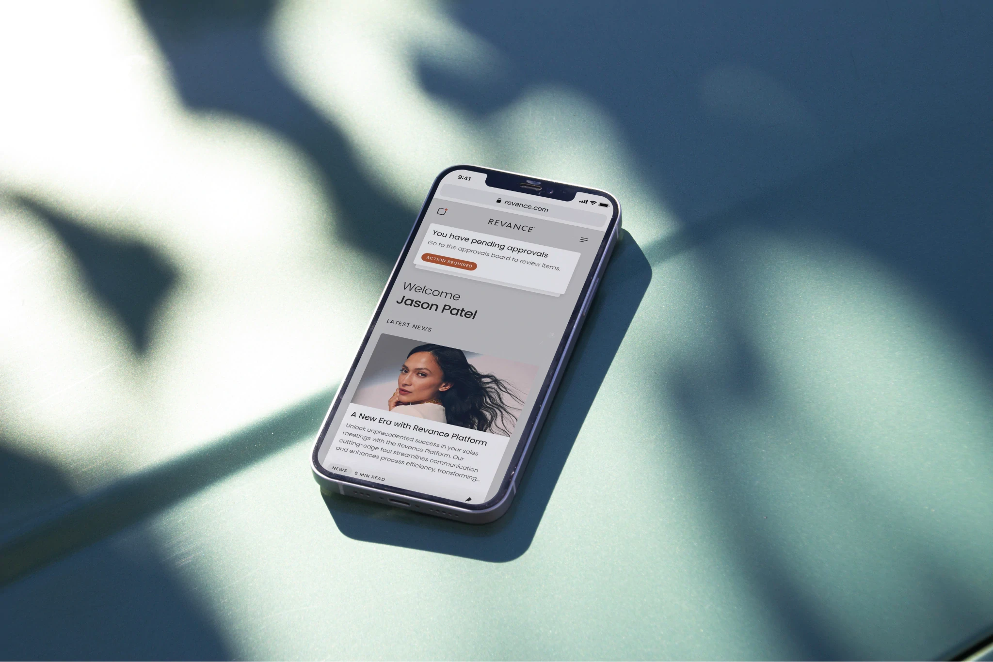
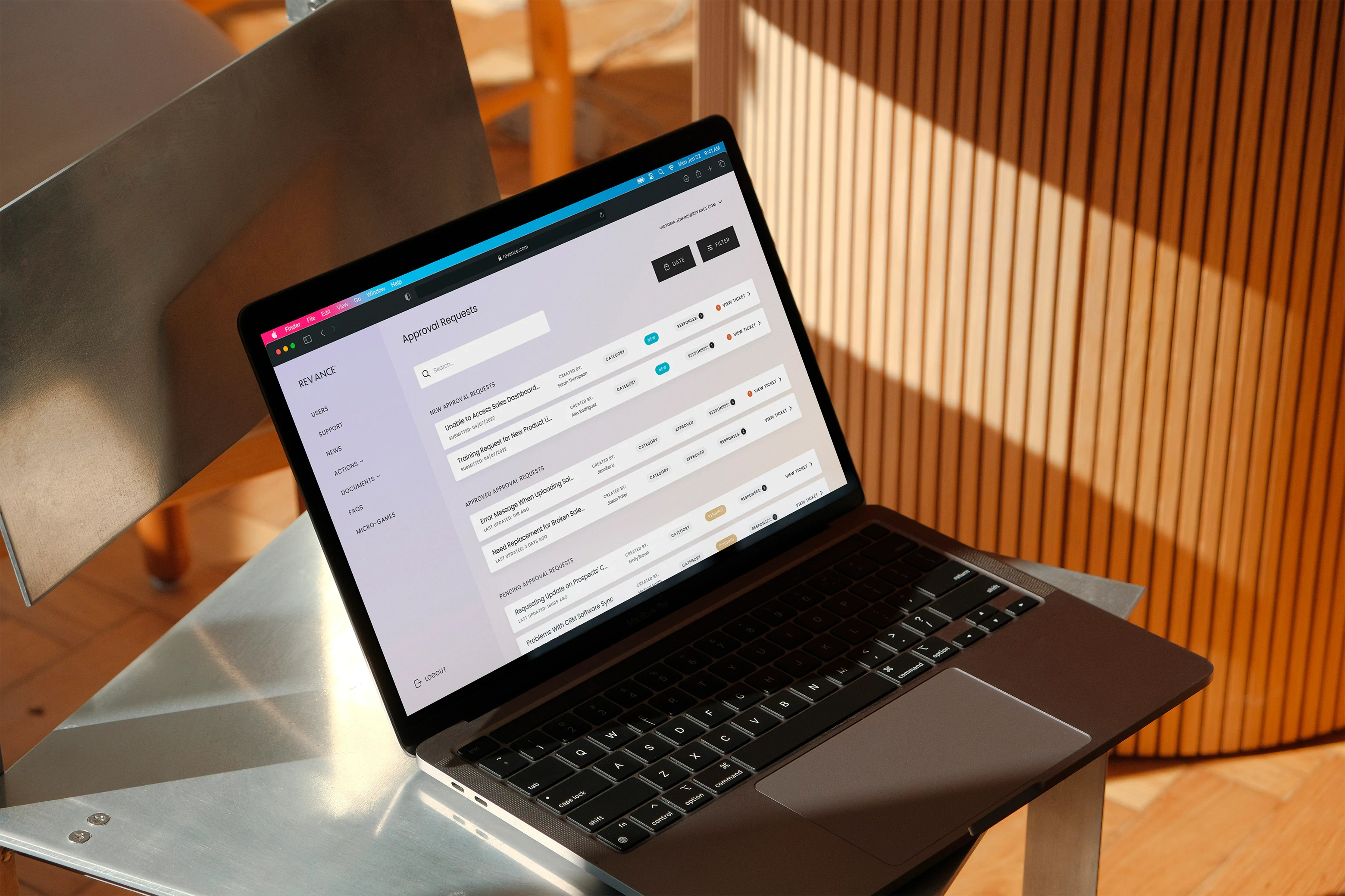
We wanted to great a clear threaded line of communications between both admins and sales users, so that communication was logically collated. For admins we also included inline threaded notes, with attachments. This is something admins and stakeholders had asked for early on so they can understand what an admin had done in relation to several admins working on a single communication thread or issue.
Conclusions
Realising efficiency and cost-effectiveness
Through the consolidation of multiple SaaS tools into a singular comprehensive platform, we've seamlessly bridged the gaps in compliance and communication processes. This transformation not only blends operational and financial advantages but also introduces a host of improvements to daily workflows.
Merging multiple software solutions into one unified platform minimises the overhead of managing various subscriptions and licenses, leading to considerable cost savings. This integration ensures that users operate within a single environment, negating the need to switch between different tools. The direct benefit of this is a marked reduction in complexities, faster completion of tasks, and fewer errors.
The streamlined nature of our platform also means that introducing new team members to the organization becomes more straightforward. Faster onboarding translates to quicker productivity, benefiting both the individual and the company. Furthermore, the consolidation eradicates typical technical challenges that arise when meshing various tools. Users experience fewer technical disruptions, leading to a more reliable and consistent operational flow. On the backend, maintenance and support become considerably simpler. Overseeing just one platform means it's easier to troubleshoot, roll out updates, and maintain peak performance.
In essence, our platform is more than just a tool—it's a strategic move towards enhanced efficiency and financial prudence in compliance and communication efforts. Its adaptive design ensures it remains a forward-looking solution, poised to evolve in tandem with the organisation's future needs.
Retrospective
The journey through this project underscored the crucial nature of stakeholder engagement in any design process. Every discussion, feedback session, and workshop was a testament to the multifaceted perspectives they brought to the table. Understanding their vision and concerns was instrumental in shaping the project's direction.
However, one of the nuances we uncovered during the process was the need for more intensive user research, particularly from our largest persona group. The depth of insight we achieved was valuable, yet there's an underlying feeling that there were layers of user preferences and pain points yet to be unraveled. A more robust research methodology, perhaps with more direct user engagement sessions, might have given us a clearer picture.
Collaboration was another key takeaway. While we maintained a consistent level of cross-functional interaction, there's room to intensify this collaboration. Strengthening these relationships can provide a more holistic view of the design, ensuring that all functional areas are aligned, and the end product is harmonious in its functionality and design.
Lastly, adaptability and fluidity in design thinking emerged as themes. We observed that while initial plans serve as good roadmaps, the ability to pivot based on real-time feedback was invaluable. Going forward, embedding a more iterative and flexible approach from the outset can help in anticipating and accommodating such changes.
Learnings
Applying knowledge from the digital learning industries into a bespoke compliance tool was a significant endeavour. Working on a fresh platform, distinct from the B2B compliance and learning SaaS products of the past, unveiled opportunities and challenges in application. This shift from traditional platforms to a more customised tool underscored the dynamic nature of user requirements and the continuous evolution of digital platforms.
The project highlighted the importance of flexible design thinking. While rooted in initial plans, the ability to adapt based on feedback and changing requirements was crucial. This dynamic design approach ensures that the end product remains relevant, user-centric, and attuned to the shifting landscape of user needs and industry standards.
Furthermore, this project brought to the fore the essence of merging diverse experiences. The marriage of digital learning methodologies with compliance requirements showcased the intricate balance required in product design. As we look ahead, these insights serve as a compass, guiding us towards more inclusive, innovative, and adaptive design solutions in the future.

Thanks for reviewing this case-study
Return to the landing page, case-studies section, to discover further in-depth projects I undertook.
